A New Look Evernote Launches
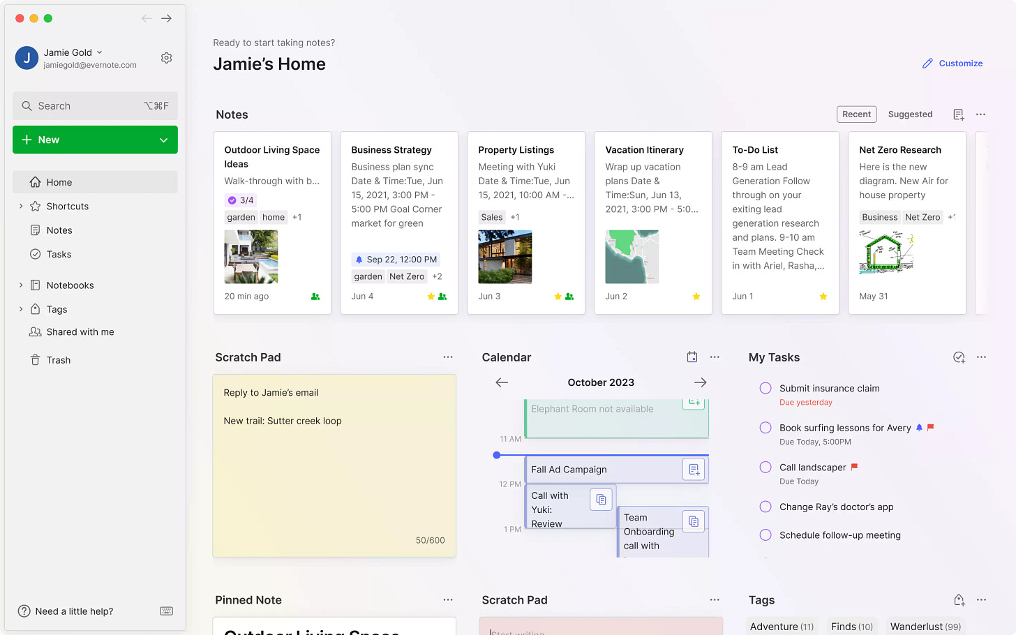
The new Evernote User Interface is slowly making its way into the wild. Do you have it yet?
The first folk to get it are the ones who signed up to test it. Once the devs are happy they’ll start pushing it out to everyone else so expect to see it arrive over the next few weeks.
There’s an official Evernote blog post all about it.
I've had the pleasure of trying out the new look for about a month and honestly, it's become second nature to me. Now, it just feels like it's always been there!
My first impressions
Lets go back in time. I first heard that Evernote we’re planning a new user interface back in August when I was invited to look at a prototype and let them know what I thought about it.
I was one of many, many folk who they’ve been in touch with over the last few months, getting opinions, ideas, thoughts and instant reactions.
The prototype I looked at was a little different to what we see today, it wasn’t a working version of Evernote, just a mock-up. I was asked for instant reactions and they also watched me perform certain tasks like creating a note.
The first impression back then was the same as it is now. I find the new interface easier to read and much more modern.
I’m glad Evernote has had a facelift. In my opinion it kind of needed it.
I’ve just updated my History of Evernote in Screenshots post with the new design.
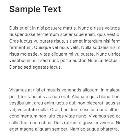
The new font - Inter
One big change. Evernote has a new font!
When I looked at the prototype back in August I wasn’t sure that the font had changed. It was subtle and I think its still a subtle change but its made the whole software, for me, more readable.
The new font is called Inter and was designed by Rasmus Andersson.
“Inter is one of the world’s most used typefaces with applications ranging from computer interfaces, advertising & airports, to NASA instrumentation & medical equipment.”
You can read and see information about the font here. Have a scroll down to see lots of examples.
From what I can gather, Inter was designed to be readable, work well in lowercase, look smooth and have a nice rhythm.
“The smaller “text” optical-size designs features a tall x-height to aid in legibility of lower-case text, with several contrast-enhancing details like ink traps and bridges.”
I must admit I really like this font and have recently installed it on my own website!
General look and feel
I think the general way to describe the new look is, lighter, spacious and less bold.
The colours have changed slightly. This is what the Evernote UI designers told me:
"In the old Evernote, all actions were green, and we saw a lack of hierarchy between various actions. So now Actions that “create something” are green and all the other actions are blue. The only colour that has remained unchanged, in terms of consistency, is purple, used exclusively to create a new activity. In this way we create coherence between actions and lighten the UI, removing redundant green."
I like the lighter look. I’ve read that some folks have found it a little too bright but for me and my old man eyes, its much more readable and the contrast seems sharper.
Dark mode to me, seems better and more readable. I’ve always found dark modes in general to be awkward to read in good natural light, great for at night but my eyes find dark mode worse in good light, if that makes sense.
The new dark mode offers me more contrast.
I also like the more spacious feel. I know some folk love their interfaces to be crammed in like a spreadsheet with as much information on the page as possible but I really struggle with that style, I lose my place on the page.
For me, the spacing between the different elements helps me see things quicker and it matches the general design styles of modern applications like Gmail, Google Docs and OneDrive.
I also quite like the “less bold” feel of the new look. I’m not a fan of bold or strong colours and prefer more pastel shades so I like this change.
Dark sidebar gone
Thank goodness. Like I said above, I’m not a fan of dark mode in natural light so having a light sidebar has made a difference for me.
I’ve read some folk are missing it and liked the contrast between the sidebar and the rest of the interface and I can understand this. For me though, the easier to read and identify text works well.
Things I don’t like
Of course there are things I’d like to see improved. There always will be.
Most of my grumbles relate to the home screen, which is where I tend to live.
The new interface seems to merge items into one, there’s not really a lot of definition between the different widgets and even after a month of using it, I’m not that used to the new home page.
I’m slightly indifferent to the phrase “Ready to start taking notes?” at the top of the home page. Maybe the date and time should be there as I’m always forgetting what day it is!
Definitely, the more you use it, the less it feels different. Currently, I just go about my work, and the interface doesn't really catch my attention – I just focus on getting things done.
Do you have the new look? If not what do you think of the screen grabs?
Have a great weekend
All the best
Jon


I have also used it but my experience was a lot different to yours. Having undergone Surgery in my left eye I found the lack of contrast make it very difficult to read. I am immensely disappointed as if this is the only option, with no means of customising it I fear that this will spell the end of my largely satisfied use of Evernote over the past 12 years, and I regret I will require to find a new home for my 28,000+ notes. I have submitted feedback to Evernote and can only hope that they take my comments into consideration.
I'm confused. The email I have received says: "How can I try the new UI?
For Evernote Desktop, all you need to do is make sure you install version 10.73.3 (or newer). For Evernote Web, updates are instead automatic. We are rolling out the new version gradually, so if you've not received it yet, just hang tight for a few more days."
So I am on 10.73.3 but no new UI. The wording on the email is ambiguous so I guess that after you have 10.73.3 you THEN need to wait for the new UI to be granted?