Evernote Launch New Mobile Home Screen for iOS and Android. Much faster!
Newsletter housekeeping: The latest version for Mac & PC is 10.86.8 so grab it from the download page. For phones we're on 10.86.1 which should come via your app store.
I've hated the mobile version of Evernote for a long time, to the point that I pretty much stopped using it.
This has changed with the latest update where we have a new home screen experience that has seriously improved the speed and usability of the app.
A brief history of me hating the app!
I travel a lot for work and I tend to create a new travel-note for each job with all the information I need to get there and back in one piece. I can be in different towns and cities each day so I really want to know how to get there.
I store train times and connections, hotel reservations, addresses and contacts of the place I'm going and I store PDF versions of my tickets all in the note.
I would always set this travel-note as offline on my phone and create a device home screen shortcut in the Travel folder on my mobile.
Evernote let me down so many times. Sometimes the offline note wouldn't open, other times it would open, the screen would go off and then the app was shut when I opened the phone again. There's been a few times I've sworn under my breath.
Not anymore. The new update works an absolute treat now. I've used it twice so far this week for travelling and even had my training notes open during a presentation and the app worked as expected.
Nice job Evernote team!
First thing, the app now loads like a million times faster.
It’s not loading every-widget-in-the-world on my tiny phone screen with all the information crammed in at font size 10!
I did not like the widget view on my phone, I love it on desktop where I have room, not mobile.
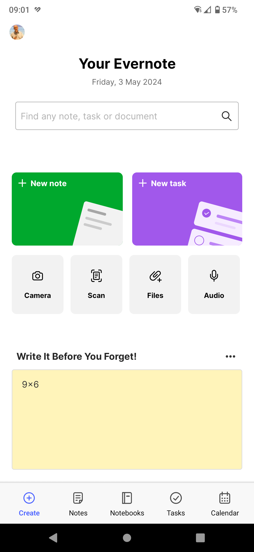
A lot of research went into the new design and there were quite a few (I think around 10) designs floating about. The one that folks seemed to like the most was the one you’ve got and the main reason was that it gave you the chance to create and find very quickly.
This video from Evernote explains a bit more about process they went through when designing the home screen.
Searching on the new home screen
I love this! Just tap the search bar and you get a full screen search page listing recent searches, saved searches and filters.
New notes and tasks
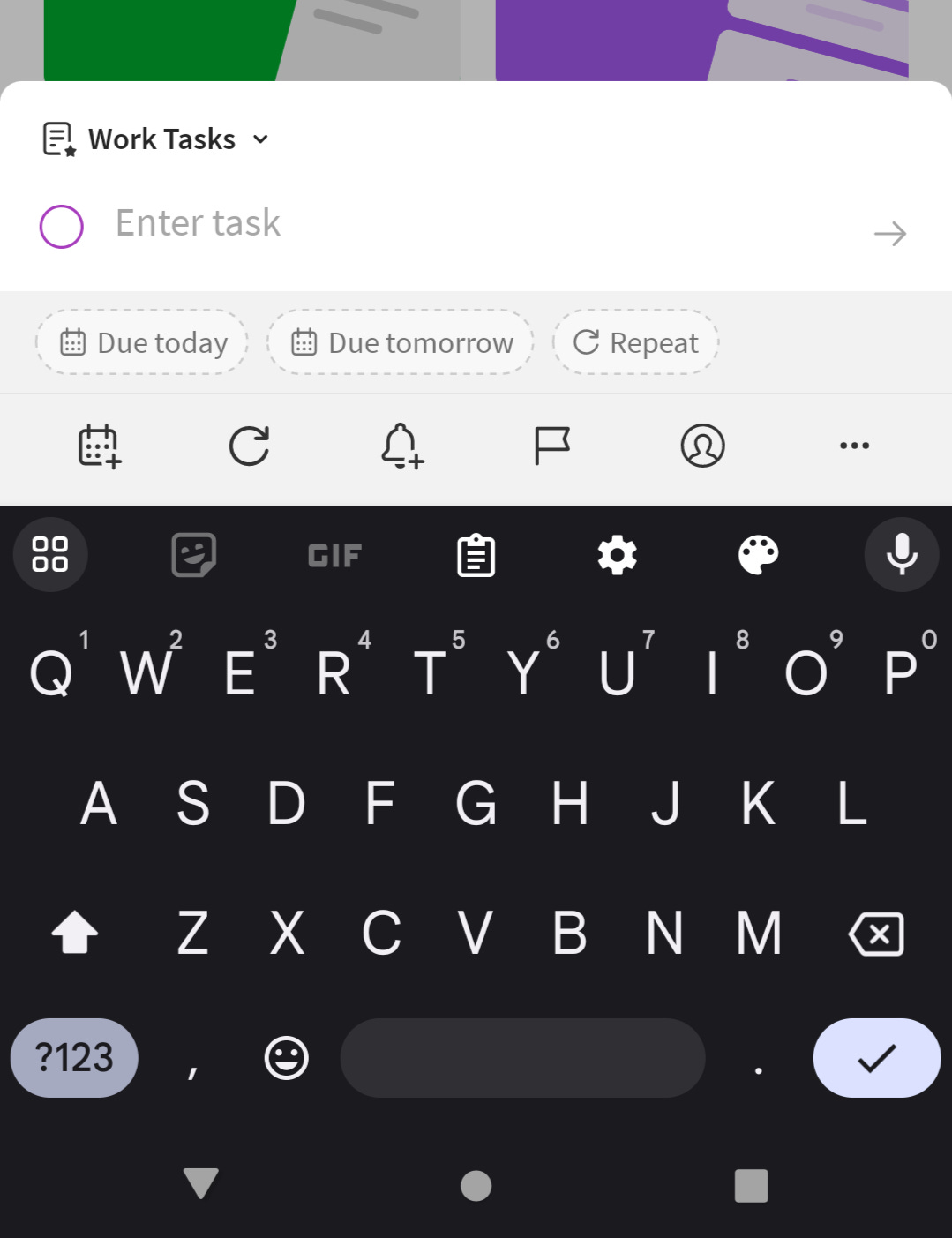
Just tap the button and away you go.
The process for creating a new note and task is now much smoother, especially a new task. I used to hate creating a new task on mobile as it was so clunky.
Other actions
Taking pictures, scanning, adding files and audio is much easier to do now.
I think in the future we'll see more items in this section of the home screen.
The scratchpad
Lots of folk love the scratchpad.
Some of the earlier versions of the new home screen didn't have the scratchpad and oh the drama! Lots of folks missing it and wanting a really easy way to right down something very quickly, so it came back.
I don't use the scratchpad a lot but when I do it's important. Right now, mine says 9 x 6 which is the size of an external vent I've got to buy when I remember!
To see the scratchpad, you must have one on your desktop/web home screen, so if its missing log into the big app and add one.
Finding tags and shortcuts
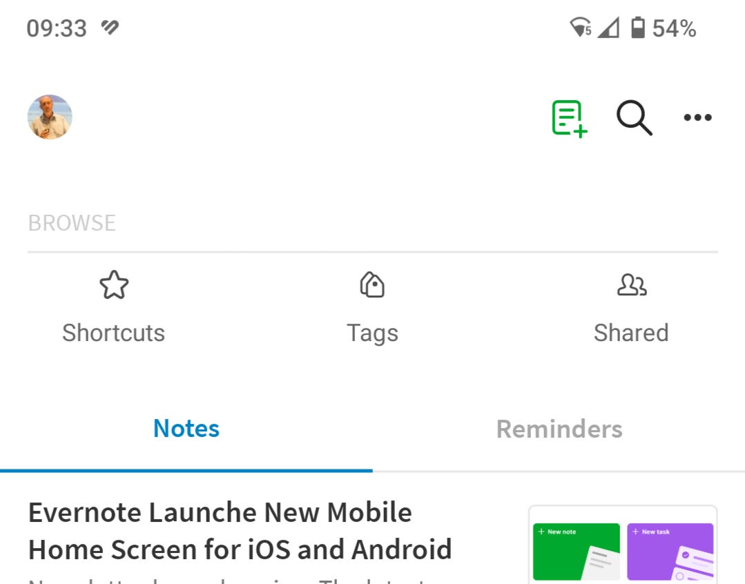
One thing that’s moved from the home screen are tags and shortcuts.
You find them by clicking the "Notes" button at the bottom, you'll see sections at the top of the screen.
During the design process there was a lot of chat about having shortcuts on the home screen as they are quite popular, scratchpad won during the testing.
I like my shortcuts but I don't really miss them from the home screen. I use my phone Evernote in a very different way to desktop Evernote so I don't need to replicate everything exactly the same way. If something is important, I tend to create a device home screen shortcut and get to the note quickly that way, I always have done, even with the really old version of the app.
I know I've said it before but not a whole load of folk use tags so you'll need an extra tap to get to them. I'm hoping that in the future tag management and discovery becomes better so more people use them. I might even use more myself!
Some small things
You can get to the settings by clicking your avatar profile thingy at the top left-hand corner.
If you really want the all-the-widgets-in-the-world view then it’s in the settings under "My Widgets". You can't set this as default though.
Clicking the "Create" button at the bottom left will get you back to the new home screen from anywhere in the app.
Click the tasks button at the bottom and see all your tasks in full screen. Love this and so much quicker!
What I'd love to see in the future
This new version is a huge improvement and most of the folk I've spoken to love it but I always want a few new shiny things.
Background sync so whenever I open Evernote it reflects what I've done on desktop.
I'd like the tasks screen to remember the tab I'm in. I always switch to "Due Dates" view so it would be nice if the app remembered this.
Ability to save notebooks and tags as shortcuts on your device home screen.
It would be nice to have some of the recent desktop improvements on mobile like table of contents and collapsible sections.
What do you think of the new home screen? Let me know in the comments.
Have a great weekend
All the best
Jon


Thanks for the update! I loved Evernote's simplicity and UI but the overall speed on mobile was too bad that I switched over to Obsidian. I'll be keeping close tabs with what Bending Spoons is working on and maybe I'll return someday when everything is much more stable.
The version I have doesnt have the scratchpad and has Shortcuts instead of Notebooks at the bottom. Not a fan as this means Ive got at least 3 clicks just to find/open a notebook.