
Evernote launches a new logo and website

A huge thank you to all paid subscribers and many thanks also to those who bought me a coffee. Taming the Trunk is 100% reader supported, no ads or commission links and your support is really appreciated.
No AMA this week as there’s so much going on in Evernote world!
I’ve spoken about version 11 of Evernote a few times and some of the AI functionality has just been officially teased together with a new logo launch.
This post will look at the logo and on Friday, I’ll talk more about the new AI features in the usual long article.
So Evernote has a new logo and the elephant lives!

I remember on an Evernote expert call a couple of months ago the team announced they were looking at redesigning the logo and a whole bunch of folk screamed “Don’t get rid of the elephant”.
The elephant is known as Mads and was named after one of Evernote’s early investors, this is back in the 2000s. Mads has had a redesign.
I quite like it. It’s not a lot different than the old one.
Here’s the new and old together.

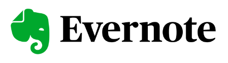
The design of the elephant has been simplified and streamlined a little. The trunk is slightly shorter, the ear is different and the eye is straightened out.
The font is much better. Nice and round instead of the serif style font.
One very nice touch. If you look carefully at the space in the letter ‘e’ it matches the eye of the elephant.
I like this attention to detail.
The website has also changed a fair bit. Again, simplified a little and each page talks quickly about each feature.
They have also introduced some new icon styles that are scattered around all the pages.

It looks nice.
The big question is what do you think? Do you like the new logo? Do you not care a jot about logos? Let me know in the comments.
Have a great rest of the week.
All the best
Jon
I like the new logo. It is "softer".
Thanks for pointing out that the eye in the E and the eye in the elephant are aligned. I would never have noticed that.